How Big Should the Text Be on a Custom Printed Banner?

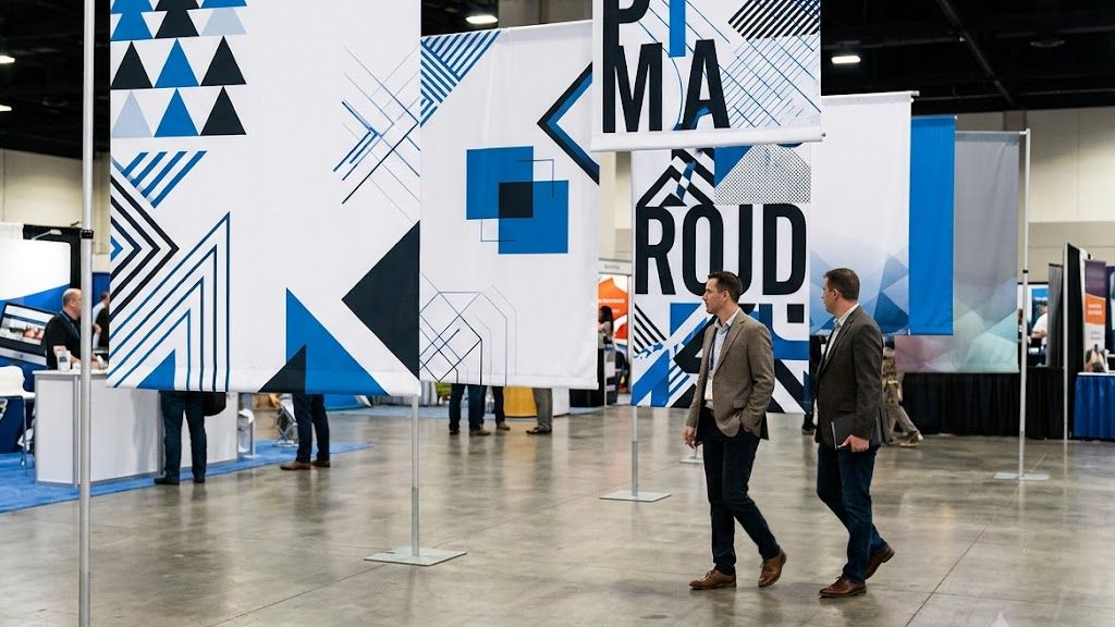
Banner text size follows a simple rule: at least one inch, or 72 points, of letter height for every 10 feet of viewing distance. We size fonts after confirming banner dimensions and read-distance. A message that’s too small at 20 feet loses impact and undermines the investment in custom printing.
What is the rule for banner text sizing?
The standard rule for banner text sizing is to make the font at least 1 inch (72 pt.) tall for every 10 feet of viewing distance. This guideline ensures that anyone standing that far away can read the message without squinting. We apply this rule as the baseline for every custom sign readability distance calculation we perform at our facility.
How do we convert viewing distance to point size?
Converting viewing distance to point size follows a simple ratio. According to the James Madison University School of Media Arts & Design, 1 point (pt) equals roughly 1/72th of an inch. This means a 72 pt. font produces letters approximately 1 inch tall. For a banner meant to be read from 30 feet away, the primary text needs to be at least 3 inches tall, which translates to 216 pt.
| Viewing Distance | Minimum Letter Height | Minimum Point Size |
|---|---|---|
| 10 feet | 1 inch | 72 pt. |
| 20 feet | 2 inches | 144 pt. |
| 30 feet | 3 inches | 216 pt. |
| 40 feet | 4 inches | 288 pt. |
Why does the core message need the largest font?
The core message on a banner must use a larger font size than any less crucial information. If the headline and the secondary details share the same size, the viewer cannot distinguish what matters most. We prioritize large format printing typography by establishing a clear hierarchy: the primary message gets the biggest treatment, supporting text gets a step down, and fine print sits at the smallest readable size. This approach prevents visual clutter and ensures the key takeaway registers first.
For Custom Printed Banners & Flags, we follow this sizing rule from the planning stage. Determine the maximum viewing distance first, then size the headline text accordingly. Everything else on the banner scales down from that anchor point.
How does viewing distance affect font size?
Viewing distance dictates every typography decision for Custom Printed Banners & Flags. The most popular guideline sets a minimum of one inch (72 pt.) of letter height for every 10 feet of viewing distance. A banner read from 50 feet away needs letters at least 5 inches tall. Ignoring this ratio forces viewers to squint, and they will walk past the message entirely.
Custom sign readability distance works on a simple principle: the farther the audience, the larger the type. We apply this rule before any other design choice. The physical banner size matters less than the distance from which people will actually read it. A 4-foot banner viewed from 30 feet requires the same 3-inch letter height as a 10-foot banner viewed from the same spot.
How do we calculate the right letter height?
We measure the primary viewing distance first. Then we divide that distance by 10 to get the minimum letter height in inches. For example, a storefront sign read from 40 feet away needs 4-inch-tall letters. That calculation anchors the entire layout.
What role does production quality play?
Large format printing typography depends on precision equipment to hold sharp edges at scale. Our production platform uses advanced presses and workflow tools suited to high-quality output on both rigid and flexible substrates. This technology supports demanding color accuracy and turnaround requirements, ensuring crisp letterforms at any size.
Follow these steps when planning your banner:
- Measure the farthest realistic viewing distance in feet.
- Divide that number by 10 to find minimum letter height in inches.
- Multiply the inch height by 72 to convert to points for your design file.
- Test the layout at full scale before final production.
Large format printing transforms raw materials into impactful graphics with precision and scale, which makes correct text sizing achievable. Get the distance right, and the message lands every time.
What font size for a 3×4 foot banner?
For a 3×4 foot banner, we recommend main-message letter heights between 1 and 3 inches (72 to 216 pt.). This range accommodates typical viewing distances of 10 to 30 feet, which covers most retail and event placements. The industry-standard guideline is simple: make letters at least one inch (72 pt.) tall for every 10 feet of viewing distance. A 3×4 foot banner positioned near an entrance (10 feet away) needs only 1-inch letters. The same banner across a trade show aisle (30 feet away) requires a 3-inch type for the headline.
How do we calculate the right font size for a specific viewing distance?
We apply the 1-inch-per-10-feet rule as our starting point. Measure the farthest point where someone needs to read the banner. Multiply that distance in feet by 0.1 to get the minimum letter height in inches. For a 20-foot viewing distance, that means 2-inch letters (144 pt.). This calculation applies to the primary message only — secondary text can be 50-a notable share smaller.
What about secondary text and subheadings?
Secondary information follows a different scale. Supporting text on a 3×4 foot banner typically works at 50-a notable share of the headline size. If the main message uses 2-inch letters (144 pt.), body copy can drop to 1 to 1.5 inches (72-108 pt.). We always test readability by printing a full-scale proof. Our large format printing typography expertise ensures every element. From the primary headline to the smallest legal disclaimer — remains legible at the intended distance. This approach to custom sign readability distance prevents the common mistake of cramming too much text onto a standard banner size.
For Custom Printed Banners & Flags, we recommend limiting the banner to one primary message and one supporting line. A 3×4 foot banner offers roughly 12 square feet of printable area. That space supports approximately 8-12 words at the recommended sizes. Anything more forces font sizes below the readability threshold. A banner nobody can read is a banner that fails its purpose.
How do I choose font style for readability?
Choosing a font style for readability starts with understanding that design elements like color, typography, placement, and materials play a critical role in how signage communicates a brand’s identity and stands out in a competitive retail environment. We treat typography as the backbone of large format printing typography. The wrong style makes even the best message invisible. Creative signage serves as a silent ambassador for the brand. It draws people in and guides their journey through space. A font that fights the design or fades into the background fails that mission.
What font characteristics improve readability at a distance?
We focus on three characteristics when selecting fonts for custom sign readability distance. First, choose sans-serif fonts like Helvetica or Arial for body text. They remain legible at smaller sizes and longer distances. Second, avoid script or decorative fonts for primary messaging; they blur when scaled down or viewed from far away. Third, maintain high contrast between the font color and the background. Light text on a dark background or dark text on a light background works best. Focus on visuals and what you need to show the viewer your story. The pictures, facts, graphs, and diagrams are the most important part of the poster. Choose images and diagrams wisely and make sure they clearly support your point. Always include a large picture to grab passersby’s attention.
How does font style affect brand perception in signage?
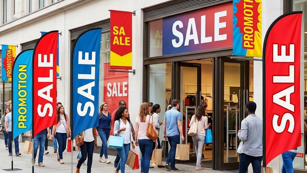
Font style directly shapes how customers perceive your brand. A bold, condensed font signals urgency and strength — ideal for sales or promotional custom printed banners & flags. A thin, elegant serif font conveys luxury and sophistication, better suited for boutique retail or hospitality environments. We match the font personality to the brand voice. A mismatch confuses the audience and weakens the silent ambassador role that signage plays. Consistency across all signage — from window decals to hanging banners — reinforces brand recognition and trust.
What mistakes ruin banner text readability?
The most destructive mistake we see in banner text readability is ignoring the relationship between font size and viewing distance. A banner with a crucial promotional message becomes completely useless when audience members cannot read the primary text from where they stand. This single error undermines every other design decision a business makes.
Why does font size matter most for readability?
We follow a proven readability guideline that maintains legibility at scale. The standard rule demands custom sign readability distance of at least 1 inch of text height (72 points) for every 10 feet of viewing distance. A banner meant to be read from 30 feet away requires a minimum headline of 3 inches tall, or roughly 216 points. Failing to apply this ratio means a banner creates visual noise rather than communication.
What other readability mistakes compound the problem?
Several additional errors combine to destroy banner effectiveness:
- Cramming too much text onto a single banner. Our clients often try to include every product detail and promotion. This forces all text smaller, making the entire message unreadable. We advise limiting the banner to one core message and letting supporting details live elsewhere.
- Using decorative or script fonts for body copy. Fancy typefaces look appealing on a computer screen but lose legibility at distance. Stick to sans-serif fonts for maximum clarity.
Our large format printing typography expertise ensures text stays crisp at the intended viewing range. We combine this with our proprietary Order Management System, which enables customers to track projects, review proofs, and manage multi-location rollouts. Improving visibility and control across every Custom Printed Banners & Flags project. The system catches readability issues before production begins.
Selecting the correct substrate also prevents readability failure. A glossy finish on an outdoor banner creates glare that obscures text. We choose matte or satin finishes for sun-exposed installations, preserving legibility throughout the day.
Getting banner text size right balances visibility with design impact—a decision that hinges on your viewing distance, audience, and environment. The principles explored here apply whether you’re designing a retail display, outdoor signage, or corporate installation. Partner with experienced designers and printers who understand how materials, lighting, and placement affect readability. Albert Basse Associates brings nearly a century of expertise to these details, ensuring your message reaches your audience with clarity and professional polish.
Frequently Asked Questions
What size text is needed for a banner viewed from 20 feet?
Use letters at least 2 inches tall, or 144 pt., for a 20-foot viewing distance. This follows the 1 inch per 10 feet rule that governs all custom banner sizing.
Should every word on a banner be the same size?
No, the core message needs the largest font on the banner. Supporting details step down in size, and fine print sits at the smallest readable level, creating a clear hierarchy.
What determines banner font size besides the physical banner dimensions?
Viewing distance, not banner size, drives the typography decision. Albert Basse Associates confirms both banner dimensions and read-distance before sizing fonts. A 4-foot and a 10-foot banner viewed from 30 feet both need 3-inch letters.
Conclusion
Banner text size is ultimately a function of viewing distance: the working rule of one inch (72 pt.) of letter height for every 10 feet of distance sets the floor for every banner, whether it hangs 20 feet or 50 feet from its audience. Within that framework, message hierarchy governs proportion — the primary headline takes the largest treatment, supporting text steps down, and fine print stays smallest — while font style, from sans-serif clarity to high-contrast color pairing, determines whether that sizing actually reads at range. Substrate and finish round out the equation, since a matte or satin surface preserves the same letterforms that glare can wash out on a glossy print. Whatever the space or occasion, matching letter height to distance, hierarchy, and finish is what turns a banner into a message people can actually read — schedule a consultation with our team at Albert Basse Associates, and we’ll help you size and produce a custom banner that gets it right the first time.